

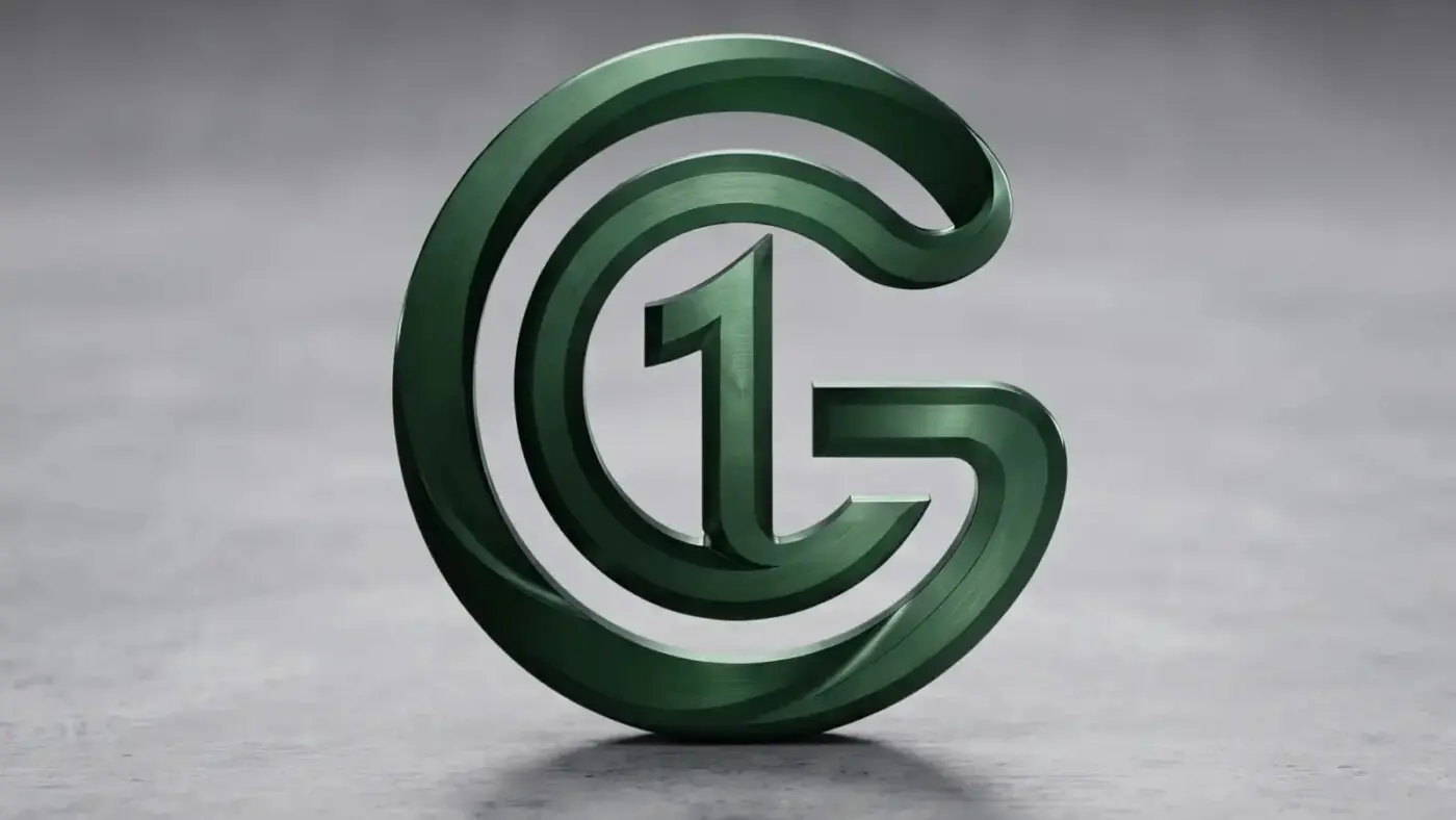
Every brand begins with a single mark, and Global Centre One begins with a deep green circle that folds into a letter and a number. At first glance it looks like a bold, modern “G.” Look a little longer and a “1” rises from its center, held inside a ribbon that never breaks. This article explains what each part of the GCO logo means, and why it was shaped this way for a platform that serves people around the world.
The heart of the logo is a simple pairing: the letter G and the number 1. Read together, they spell “G1,” a short form of Global Centre One. The G stands for Global, the first word of the name and the first letter of the GCO brand. The 1 stands for One, the promise that everything GCO offers can be found in a single, trusted place.
The G is drawn almost as a full circle, and that is no accident. A circle is the oldest picture of the world, with no beginning, no end and no corner left out. It reflects how GCO works: a company founded in Wyoming that serves customers, sellers and creators across the United States, Indonesia and beyond. Wherever someone opens the site, they step into the same circle.
Follow the line of the logo and you will notice it moves like a ribbon, curving from the outer edge toward the center without a single break. That unbroken path is the idea of connection made visible, the same word found in the company’s legal name, Global Faith Connection. It speaks of buyers finding trusted sellers, authors finding readers and families staying in touch. Each part of GCO is a turn in one continuous ribbon.
At the very center stands the number 1, upright and steady. It carries the tagline “One Ecosystem, Limitless Possibilities”: GCO Mart, GCO Books, GCO Card, GCO Digital, GCO AI, GCO Food and GCO Audio grow around one shared center and one account. The 1 also speaks of unity, of many people and communities joined in common purpose. For a company with faith in its name, it is a quiet reminder that a strong foundation keeps everything else in place.
The logo is built in layers, an outer ring and an inner ring wrapped around the center like a shelter. This layering stands for protection and trust, two values GCO places first. They show up in honest pricing and clear policies, in a membership card designed for family safety, and in website care that always backs up before anything changes. What sits at the center is guarded, and so is every person who joins.
Color completes the message. The deep green of the logo is the color of growth, of living things that take root and last, and it brings a sense of calm and stability. Soft highlights give the mark depth, as if light were falling on it. Across the GCO website, that green is paired with warm gold, which adds a touch of value and hope without losing the quiet confidence of the original mark.
Put together, the GCO logo tells a short story: a world-wide circle, an unbroken connection and one trusted center. It is more than a symbol on a page; it is a promise to every visitor who arrives at globalcentreone.com. Whether you come to shop, to read, to protect your family or to build your website, you are welcome inside the circle. One ecosystem, limitless possibilities, and a place for everyone.